Trough or Peak Analysis? Pick One!
When performing a formal phasing analysis we can either assume troughs are synchronised or peaks, but generally not both. Let's see why in this article.

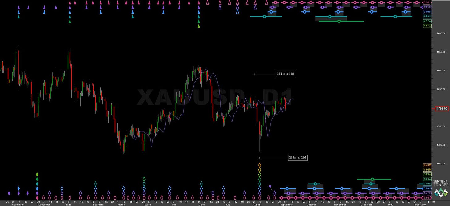
Whilst it is true the majority of phasing analysis performed on Sigma-L is assuming synchronised troughs it is always possible to choose a peak phasing if the instrument looks suitable. The general school of thought is that in stockmarkets one should phase the troughs and in some metals like gold and silver one should phase assuming peaks are synchronised.
This thought process is based around some of Hurst’s work (although Hurst phased copper at the troughs in the Cycles Course) and some of it is just based on what everyone else is doing! The proper approach should be to assess the chart and look carefully at the shape of troughs and peaks. Are the troughs generally sharp and precise and the peaks rounded? Then a trough phasing is appropriate. How about sharp peaks and rounded troughs? Then of course a peak phasing is appropriate. How about sharp peaks and troughs? Or rounded peaks and troughs?
This is where we should use our software and human knowledge to assess which is the better option. How do we know which is the better option? The answer is that one of the analysis will reveal a much better phasing, with minimal frequency modulation amongst the components and the FLD of each component will provide support and resistance at various points of the price action. These are two solid signs of an acceptable phasing analysis.
A bad phasing analysis on the other hand will require a lot of licence in isolating the synchronised peaks or troughs. Frequency modulation will be high and price highs or lows will more often not be aligned to proposed cycle highs and lows. In Sentient Trader perhaps a lot of ‘pinning’ will be required to influence the analysis - not a good sign in our experience.
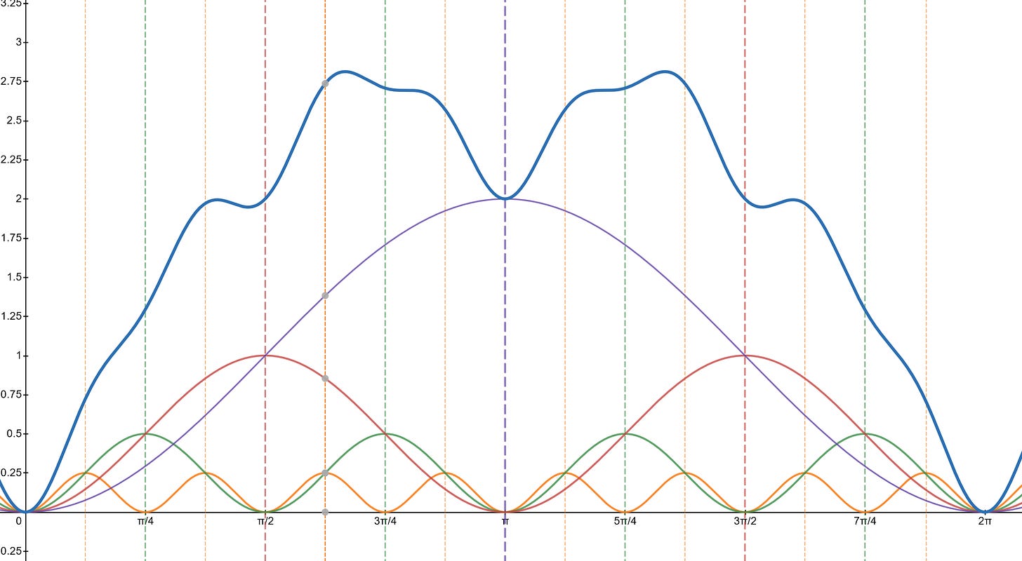
So why can we only choose either peak or trough synchronisation according to Hurst’s cyclic principles? It is because of the way the individual components of the overall price motion are summed. Let’s look at an idealised example below with sinusoids.
Idealised Price Motion Model Example
We can simply illustrate why it is not possible to have both synchronised peaks and synchronised troughs with the above chart. Here we have 4 sinusoidal components, each obeying a simple principle of harmonicity (2:1) and proportionality as espoused by Hurst in his nominal model. You can imagine each component in an analogous fashion to the periodic components in financial markets. So the purple sinusoid might be the 40 week component, the red the 20 week component and so on. The blue thicker line is the price motion composite, a result of summing the individual components.
When these discrete components are summed, as they are in financial markets, the resulting composite function has peaks that are phase shifted! The vertical lines mark the peaks in the individual sinusoids and you will see that none of the individual peaks are exact peaks in the composite model of price action! Infact the peak of the largest periodic component (purple) coincides with a fairly large low in the composite price motion.
The ‘peaks’ in the composite are rounded as each cycle component adds it’s influence into the summation and then wanes in strength. This is why trying to perform a phasing analysis on a financial market via a peak analysis and then struggling to do so will reveal it requires a trough based analysis only.
Of course the chart would be reversed for an analysis assuming synchronised peaks - the troughs would be rounded and lows out of phase with the discrete low of each periodic component.
If you found this article interesting please share it with your friends and colleagues.
Subscribe to Sigma-L for expert Hurst cycles analysis of many financial markets with long and short term overviews, price targets and levels, advanced tips and more!


