Top 10 Wow! Signals in Markets - March 2023
We've seen a range of remarkable periodic signals across all markets and timeframes over the last year or two! Discover some of the recent and past best, identified via our time frequency analysis
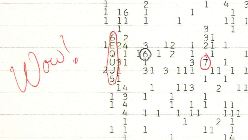
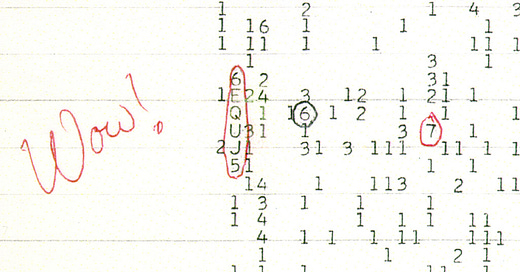
The original Wow! narrowband signal, detected in August 15, 1977 at Ohio State University and notable for the almost continuous and unmodulated frequency is similar to the kind of signal we strive to find in financial markets. In the former’s case the search was for ET, in our case we are looking for something a little more ‘close to home’, although no less remarkable, in our view!
We are particularly looking for stationarity in frequency, amplitude and, quite importantly, a significant degree of spectral separation in the bandwidth that, taken together, renders a component unlikely to be the result of random fluctuation. We also like to see at least 5-10 iterations of the component to even start to assign the ‘Wow!’ title.
The majority of our top 10 will be focused on the daily timeframe so subscribers can track these going forward with relative ease. We will also include a couple of excellent intraday examples and return to the article in perhaps 6 months or so to see how the components are progressing. Let’s begin..
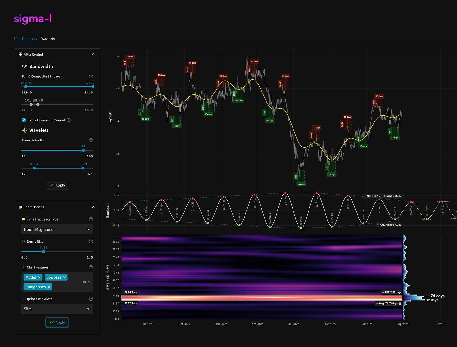
1. High Grade Copper, Daily
Component Average Wavelength: ~ 75 days
Timeframe: April 2021 - Now
Completed Iterations: 8
Next Wave Peak: ~ 17-21st April 2023
Next Wave Trough: ~ 26th-30th May 2023
Component Gain Over Timeframe1: 96.55%
The component at around 75 days in HG copper is quite sublime indeed. Not only is it retained through a strong downtrend but is notable in it’s tremendous spectral separation, with no other component in the normalised bandwidth from 140 to 16 days getting a look in.
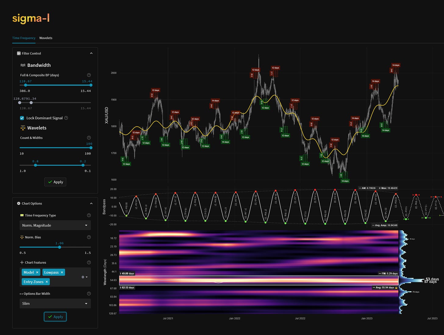
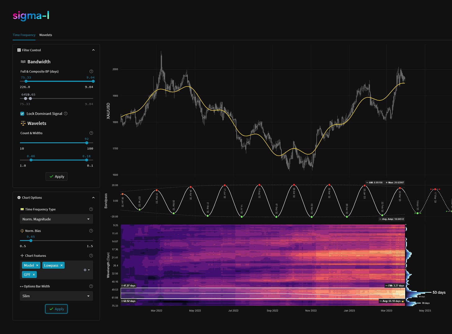
2. Gold, Daily
Component Average Wavelength: ~ 55 days
Timeframe: February 2021 - Now
Completed Iterations: 13
Next Wave Peak: Peaking / Peaked
Next Wave Trough: ~ 12th-26th April 2023
Component Gain Over Timeframe: 43.65%
Very familiar to subscribers is the component we christened ‘the beacon’ after it’s discovery in 2021. Extraordinarily stable over time, it is also present (as you might expect) in silver and related gold mining stocks. There was one tricky period in September 2022 when the component appeared to be attenuated: this was resolved by performing a time frequency analysis on commonality instruments. It has since surfaced once again in all it’s glory - even retaining good clarity within the strong recent uptrend.
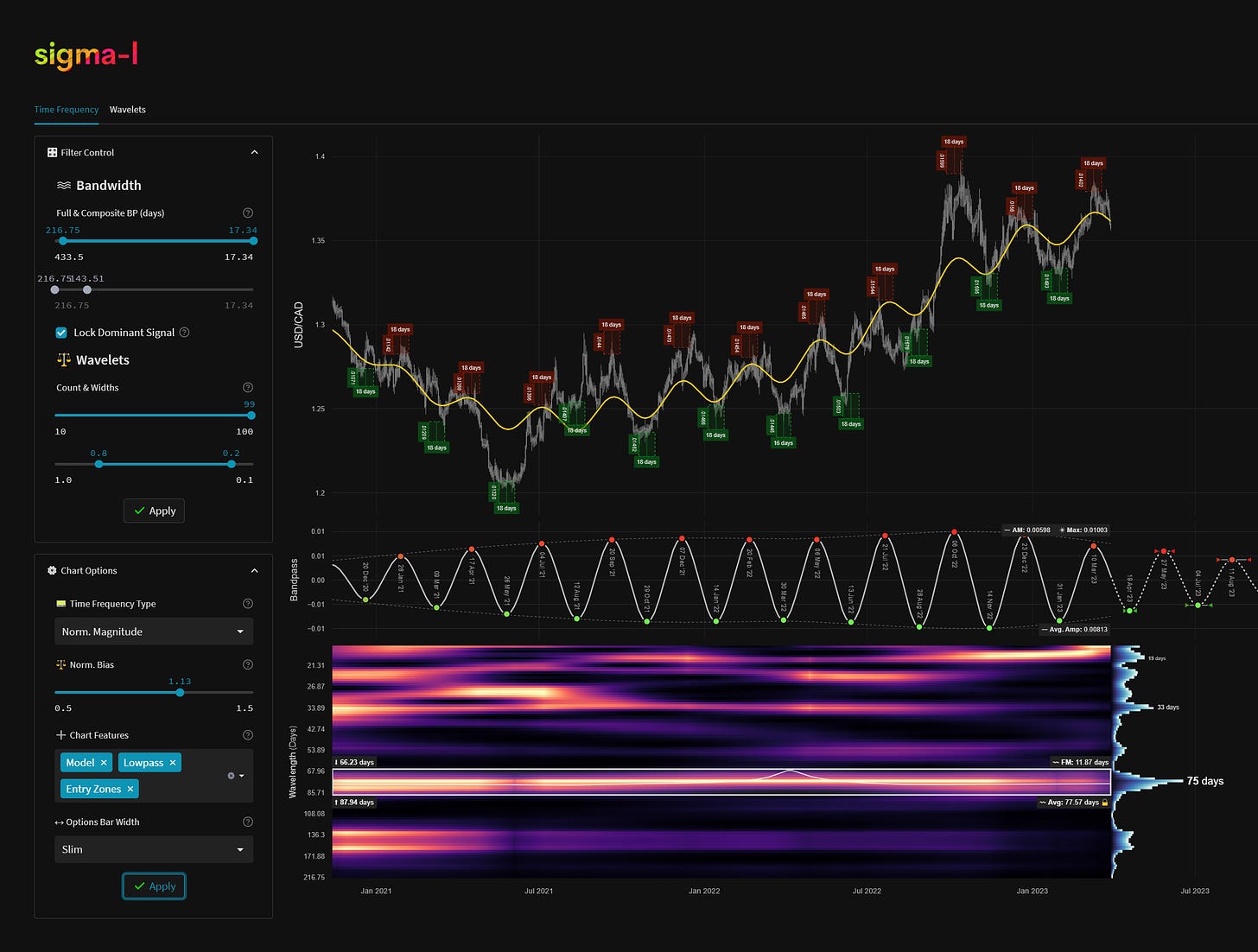
3. USDCAD, Daily
Component Average Wavelength: ~ 75 days
Timeframe: December 2020 - Now
Completed Iterations: 10
Next Wave Peak: Peaking / Peaked
Next Wave Trough: ~ 8th-29th April 2023
Component Gain Over Timeframe: 86.70%
The fantastic, metronomic component around 77 days in the Loonie has crisply defined the structure within an almost linear uptrend since May 2021. Keen traders will also note the presence of this component in related pairs, GBPCAD, EURCAD etc.
4. S&P 500, Daily
Component Average Wavelength: ~ 1300 days
Timeframe: January 2004 - Now
Completed Iterations: 5 (6 if back to 2001)
Next Wave Peak: Peaking / Peaked
Next Wave Trough: ~ July - October 2023
Component Gain Over Timeframe: 185.86%
No top 10 would be complete without mention of the hugely important wave in stock markets over the last 20 years. That component is clear as a bell at around 1300 days and a testament to Hurst’s original ‘nominal’ model for stock markets, conceived in the 1960s. This component is notionally the 4.5 year nominal wave. It is present to a greater or lesser degree in all global stock markets, the S&P 500 is shown here. This component is due a trough within the next 6 months. There is an outlier chance it has already occurred, dependent on the position of the last trough around the ‘covid’ lows, watch the smaller waves for clues!
5. USDJPY, Daily
Component Average Wavelength: ~ 180 days
Timeframe: September 2015 - Now
Completed Iterations: 15
Next Wave Peak: ~ 3rd April - 8th May 2023
Next Wave Trough: ~ 2nd July - 8th August 2023
Component Gain Over Timeframe: 71.25%
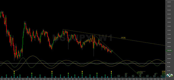
Being especially coherent in the period 2016 - 2021 the component around 180 days in USDJPY definitely belongs in this list. Whilst it has been suppressed slightly in the recent uptrend (note the frequency spread) it was crucial in identifying the large cycle (9 year ‘nominal’) low that occurred in late January 2021, along with the 40 week ‘nominal’ wave (~ 350 days). Very recent price moves have hinted at a return to clarity
.

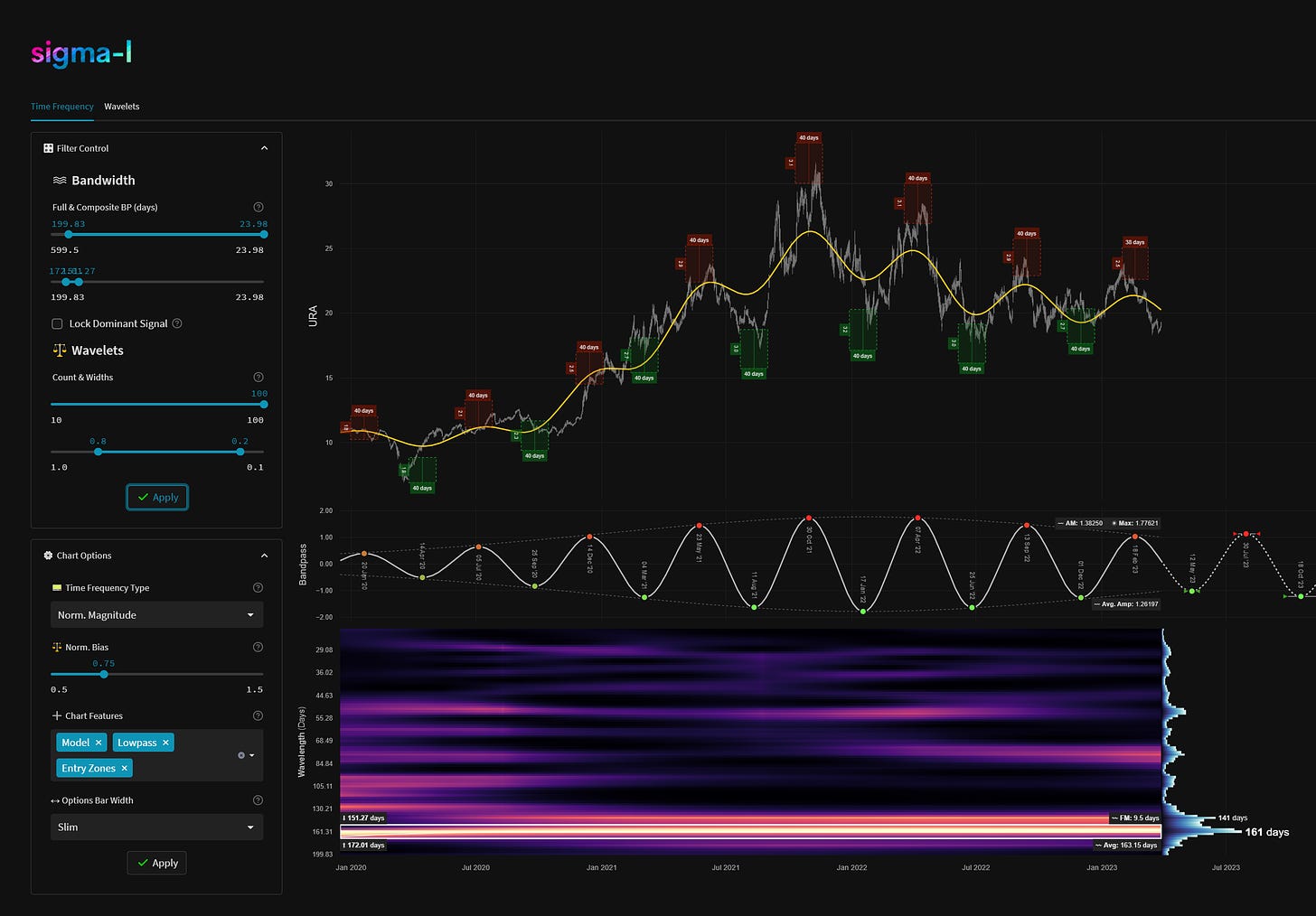
6. Uranium (URA), Daily
Component Average Wavelength: ~ 160 days
Timeframe: March 2020 - Now
Completed Iterations: 6
Next Wave Peak: ~ 20th July - 9th August 2023
Next Wave Trough: ~ April 29th - May 22nd 2023
Component Gain Over Timeframe: 163.75%
Exploding out of a 9 year nominal low in 2020, Uranium, shown here via popular ETF URA 0.00%↑, began to form an excellent component around 160 days in wavelength - notionally the 20 week 'nominal' wave. The stationarity has been a highlight for the last year and this wave is now approaching the next trough iteration. That low will also likely be of higher degree, watch this one closely if you follow the energy sector.
7. Apple (AAPL), Daily
Component Average Wavelength: ~ 120 days
Timeframe: October 2019 - Now
Completed Iterations: 10
Next Wave Peak: Peaking / Peaked
Next Wave Trough: ~ 10th May - 9th June 2023
Component Gain Over Timeframe: 170.62%
Within each equity index there will be stocks with signals of greater clarity, contributing in turn to the overall average signal. Apple is one of these, displaying a superb rhythm at around 120 days, notionally the 20 week ‘nominal’ component in Hurst’s original model. This heavyweight stock is heavily metronomic and highly influential.
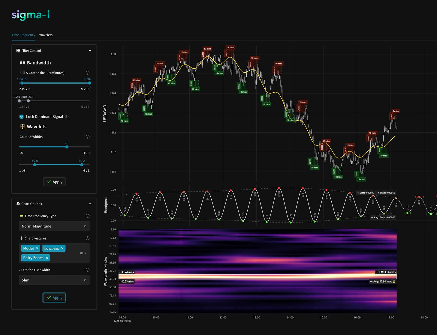
8. USDCAD, Intraday, March 13th 2023
Component Average Wavelength: ~ 43 minutes
Timeframe: ~09:00 to 17:00 GMT
Completed Iterations: 11
Next Wave Peak: N/A
Next Wave Trough: N/A
Component Gain Over Timeframe: 0.92%
Intraday cycles are subject to increased frequency and amplitude modulation, a time frequency analysis is essential in this timeframe to understand the dynamics. Stationarity is often present however and March 13th was one recent example. This component moved with superb accuracy all day and was ‘beacon’ esque in it’s clarity, allowing for profitable trade timing, even within a strong downtrend.
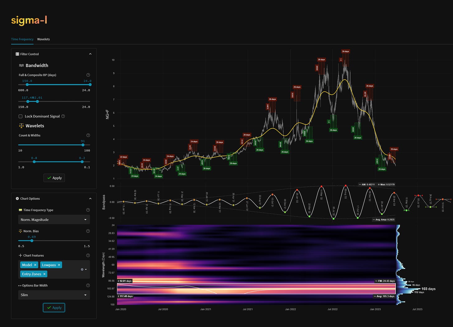
9. US Natural Gas (NG), Daily
Component Average Wavelength: ~ 105 days
Timeframe: ~ Jan 2020 to Now
Completed Iterations: 10
Next Wave Peak: Peaking / Peaked
Next Wave Trough: ~ 3rd May - 13th June 2023
Component Gain Over Timeframe: 317.66%
US Natural Gas is a good example of how periodic components can increase in amplitude over time, driving price as a result. This component, running at an average of 105 days and most prevalent in the period late 2021 to early 2023, was an excellent signal. It was almost totally dominant at one point, returning excellent trades on both the long and short side. The strong recent downtrend has dampened the wave somewhat but it will return, a potential low is coming around May this year.
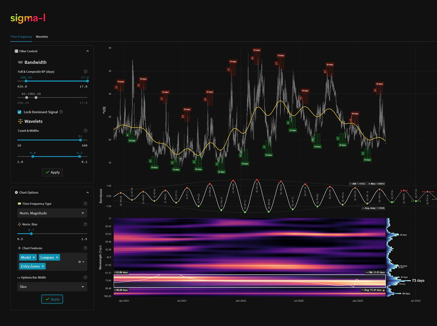
10. VIX (CBOE Volatility Index), Daily
Component Average Wavelength: ~ 73 days
Timeframe: ~ December 2020 to Now
Completed Iterations: 11
Next Wave Peak: ~ 4rd May - 10th June 2023
Next Wave Trough: ~ April 10th - April 24th 2023
Component Gain Over Timeframe: 395.52%
The VIX is an instrument we have been tracking for some time, observing it closely for signs of any periodic stationarity, such is the connection to stock market price action. Although it is relatively noisy compared to some of the serene components on this list there is quite a fair signal around 73 days we have been noting. This happens to be similar to the 80 day ‘nominal’ wave in Hurst’s model for stock markets (~ 68 days), which is of significance, in our view. The component is due to trough in mid April 2023, at the current wavelength. It will be fascinating to return to this one in due course.
Component gain is calculated in this instance by measuring the percentage gain over the timeframe. The following simple criteria is applied assuming a starting capital of 1: the trader buys within the frequency modulation buy zones of troughs and sells within the FM sell zones at peaks. The zones are denoted on the charts by the red and green ‘entry zones’. Each ‘trade’ is exited at the subsequent peak or trough time and the associated price level.
Below is an example of the ‘gain per frequency’ function used to calculate the above strategy per frequency in Gold. Naturally the highest gains are clustered around those components that are correlated to price action.


